Be sociable
Want to hear more from us? Then here's some of our favourite hangouts...
Jubilee Business Park,
2 Jubilee Pkwy, Derby DE21 4BJ
Koobr Ltd.
Registered in England: 08353557
Be sociable
Want to hear more from us? Then here's some of our favourite hangouts...
Jubilee Business Park,
2 Jubilee Pkwy, Derby DE21 4BJ
Koobr Ltd.
Registered in England: 08353557

– eMailmonday
With the number of smartphone users in the UK dominating other forms of internet browsing, as well as the growing number of users at home migrating from desktop to tablet, now is the time to ensure you’re using a responsive email template optimised for mobile.
Email is still widely regarded as one of the most effective platforms for businesses to distribute content and market their products and services. So, it only makes perfect sense to optimise your mailer template to work across all mobile devices.
In the same way a non-responsive website renders differently on a mobile device, so does a non-responsive email template, sometimes failing to open altogether. This significantly reduces the number of people successfully reached, whilst negatively effecting your marketing spend, as each unsuccessful email is unlikely to generate any financial return.

Furthermore, unresponsive emails that fail to open or look clumsy on mobile devices will set a bad precedent for your company image, which can lead to once loyal subscribers unsubscribing from your communication efforts.
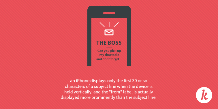
Be mindful of what you put in your ‘from’ label, subject line and pre-header text (this is the short summary line that follows the subject line when viewed in the inbox), as you only have limited space to get your point across and grab the attention of your readers.

With such a small amount of screen space available on mobile devices, it’s so important to make mobile-optimised emails as succinct as possible. Avoid long paragraphs in the text-body and place the most relevant information at the top. This will ensure the reason/meaning for your email is understood right away.
The mentality for mobile users is to ‘press’ rather than ‘click’, so if you want them to perform specific actions, use a button instead of a hyperlink. Make it easy to spot and clearly signposted to explain why users should press that button – “Tap here to get your free download”, for example – and leave plenty of space around it to prevent any mishaps.
Get in touch and tell us all about it.